Helping an ACO’s care team schedule more patients in less time
Patient access coordinators scheduled 32% more patients each week, while a sister team on a comparable tool stayed flat.
- Role
- Design Director, Supergreen. I did most of the research and design myself.
- Client
- A South Florida ACO network
- Timeline
- 6 months
- Team
- Two Supergreen teammates (participant recruiting and scheduling, final UI production), the client’s in-house engineering team
- What I did
- Research, workflow and interaction design
Caretracker is the tool an ACO’s Patient Access Coordinators use, alongside their electronic health record (EHR), to find patients with gaps in care and get them scheduled. I ran three rounds of research with a 12-person panel of coordinators and practice staff, then redesigned the work queue and patient workflow and brought EHR scheduling and click-to-call into one place. Coordinators on the redesigned tool scheduled 32% more patients per week. A sister team in the same network that moved to a different tool stayed flat, and is now copying these changes.
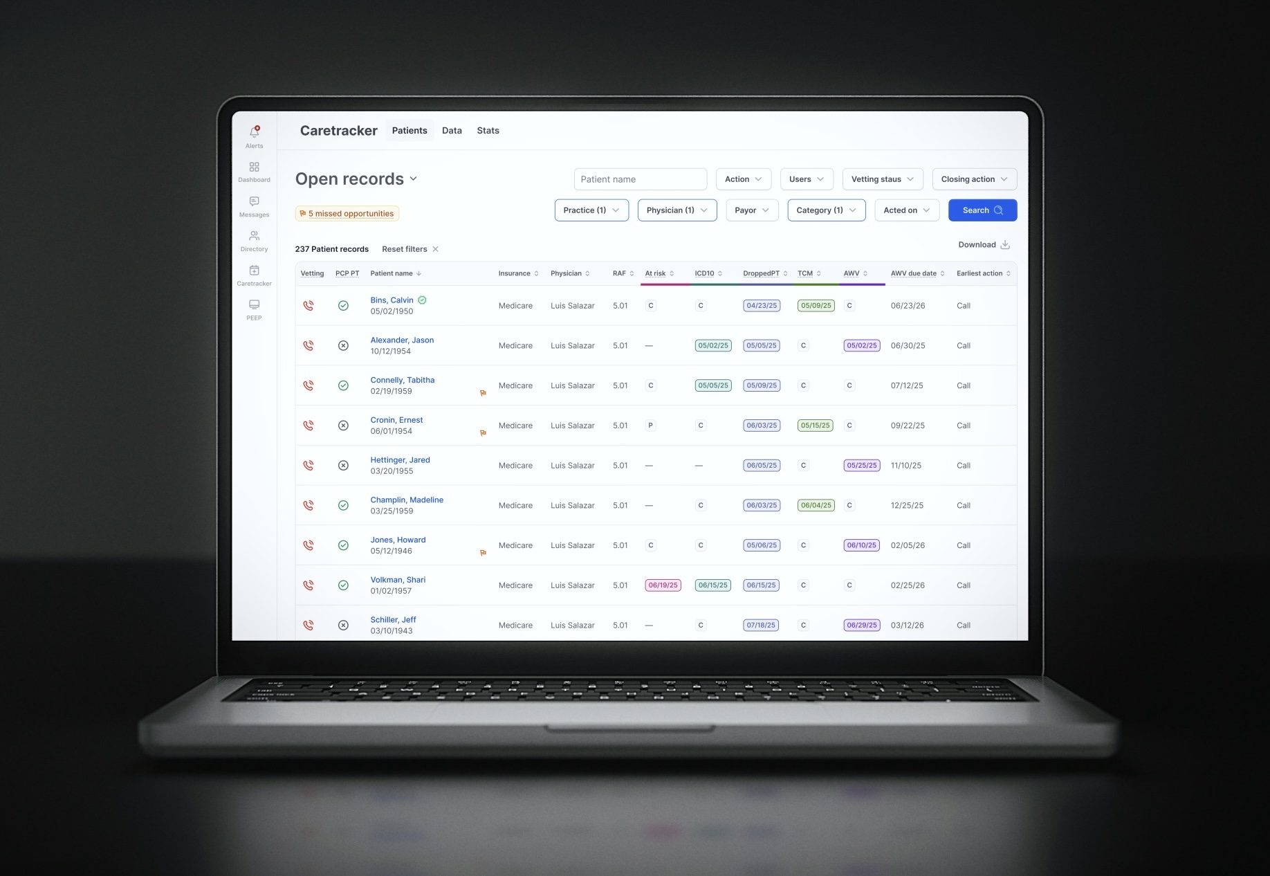
Where better care and better business align
An Accountable Care Organization (ACO) is a network of doctors and practices that shares responsibility for the quality and cost of care for a group of patients. Insurers reward physicians and the ACO when patients get the care they need, such as an annual wellness visit or a follow-up after a hospital stay. That makes closing a “care gap” one of the rare places in healthcare where better care and better business have shared incentives.
Closing gaps begins with a phone call. Each morning, Patient Access Coordinators open a queue of patients who need outreach. They review each patient, check details in the EHR, call, and book the visit. When I started, the team scheduled 150–200 patients a day. With hundreds of patients in the queue, every extra click meant fewer patients reached.
Listening before solutioning
With my team’s help recruiting and scheduling, I built a 12-person reference panel from the people who use Caretracker every day: coordinators and physician-practice staff. I met each one individually, over three rounds:
- Round 1 (discovery, 8 people: 6 coordinators, 2 practice staff): how Caretracker fits their workflow, and what helps or gets in the way
- Round 2 (testing, 5 people): reactions to a new dashboard and proposed workflow
- Round 3 (validation, 3 people): a final check before build
What I heard was consistent:
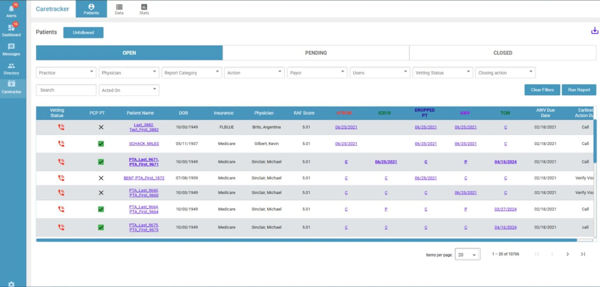
- The queue was dense and hard to scan.
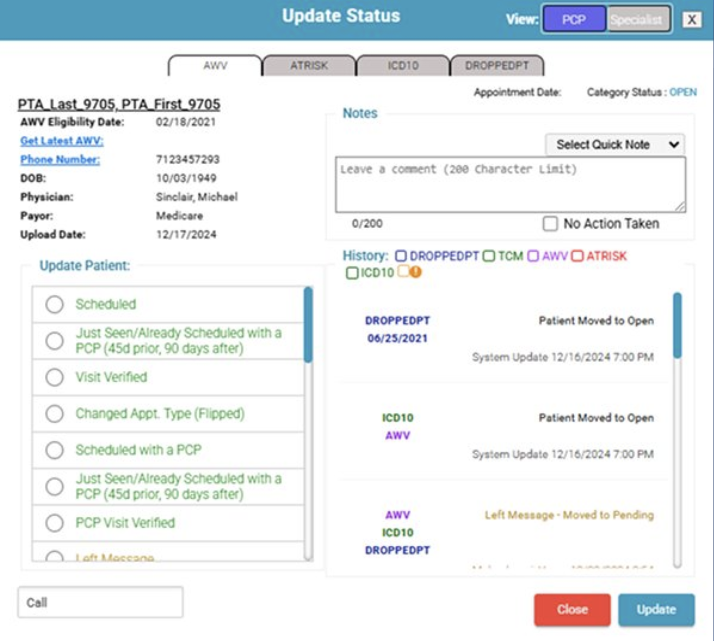
- The patient-status window was cramped and easy to get wrong.
- After every patient, coordinators had to go back to their filtered list to find the next one.
- To book a visit, they copied patient details into the EHR, a separate system, and then came back.
Three rounds of research
Individual virtual sessions with the people who use Caretracker every day, narrowing from open discovery to final validation.
- ROUND 01
User Discovery
8participants6 PAC team · 2 practice
- ROUND 02
User Testing
5participants3 PAC team · 2 practice
- ROUND 03
User Testing
3participants2 PAC team · 1 practice
Streamlining the workflow
The obvious fix was a visual refresh: cleaner table, better colors. But the research showed the slowdown came from the flow, not the screens. Coordinators lost time between patients and between systems, not inside a single view. So I set one goal: keep the coordinator moving from one patient to the next without retracing their steps.
Three decisions that shaped the redesign
1. Turn the patient window into a working page with “Save & Next”
Patient status lived in a small pop-up with a long list of options. When a coordinator finished, they closed it and went back to the list. I replaced it with a full-page view:
- A counter showing how many patients remain
- A Save & Next button and a Skip option
- Status actions placed next to the patient’s history, so the right choice is clear
- A one-click copy of the date of birth for EHR lookups
Cleaning up the pop-up would have looked better without changing the time lost between patients. The full page removed that loop: coordinators stopped going back to the filtered search after every patient. No more waiting for the search to reload after every patient.
Streamlining the scheduling process
Before, finishing a patient meant going back to the list and waiting twice: once for the list to reload, again for the next patient to open. Now Save & Next moves straight from one patient to the next.
- 01Choose patientPick the next patient from the filtered list.
- WAITPatient detail loads (30s)
- 02Verify in EHRConfirm patient details.EHR
- 03Call patientReach the patient to schedule.Phone
- 04Update statusRecord the outcome and add a note.
- 05Back to listClose the patient and return.
- WAITList reloads (30s)
↺ Repeat for every patient, with two waits each time
- 01Patient detailOpens on the next patient in the list.
- 02Verify in EHRConfirm patient details.EHR
- 03Click to callDial the patient right from the app.
- 04Update statusGrouped, inline status actions prevent mistakes.
- 05Save & NextSaves and goes straight to the next patient.
↺ The next patient opens directly: no reload
2. Make the queue scannable without losing anything
Coordinators relied on every field in the queue, so I didn’t remove any. Instead I reorganized it:
- Moved the filters into the header and tucked away the ones used less often
- Grouped related data into shared columns to save horizontal space
- Added color-coded category chips to tell patient types apart instantly
- Added flags for missed opportunities so urgent patients stand out
The result fits everything on screen without scrolling.
3. Bring the EHR to the coordinator
Scheduling meant switching systems, so I designed integrations that put what coordinators needed inside Caretracker:
- EHR data marked with a green check when verified
- Available appointment times filtered by physician and practice, following each provider’s own scheduling rules
- Click-to-call, with the rest of the screen locked during a call so no one navigates away mid-conversation
Integration costs more engineering effort than interface changes, so we sequenced the work with the client’s engineers:
- The new queue and patient page
- Click-to-call
- Scheduling
Each release paid off on its own while the next was built.
What changed
32% more patients scheduled per coordinator each week. The network runs two Patient Access Coordinator teams doing the same kind of outreach. The team that stayed on the redesigned Caretracker rose 32% in weekly schedules per coordinator. The sister team, which moved to a different tool, stayed flat over the same period.
A tale of two products
Two teams using comparable tools with diverging performance.
How we measured: Weekly schedules per coordinator, rolling two-month average, 2026 compared with 2025, from the network’s scheduling data.
Alongside that:
- Daily volume rose from 150–200 to 200–300 patients, without coordinators going back to the filtered search between patients.
- Coordinators reported feeling about 50% more productive (from user feedback, not measured).
- The sister team is now adding the same changes to its new tool. That’s the clearest sign the design, not the team, made the difference.
What I learned
Workflow is the key to unlocking performance. For the same client, a well-designed Chrome extension that sat next to the EHR saw little use. Caretracker worked because it improved the workflow people already used instead of asking them to adopt something new.
Ship in pieces that each stand on their own. Sequencing the queue first, then calling, then scheduling meant coordinators felt improvements months before the full vision was built.
Measure from day one. The comparison came from the network’s own reporting, and I was glad it existed. Next time I’d agree on the baseline and success metrics with the client before research begins, so the result is planned rather than found.